Thursday, March 28, 2013

After Effects Tutorial Green Screen Keying in After Effects with KeyLight

I found this tutorial from Mikey Borup, to eliminate background videos using green screen
Brilliant tutorial, just the very thing I've been looking for to help with my uni work. Thank you, Mikey. :)
What I liked about this tut is it wasn't just about keying, it showed how you use the keyed footage... most tuts focus on just one element, but you showed several here. Thank you! Liked and Subbed!


 After Effects Tutorial Green Screen Keying in After Effects with KeyLight

Wednesday, March 27, 2013

Chuck (Charles M.) Jones one of the most revered animators, directors, and writers


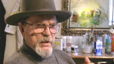
Charles M. "Chuck" Jones* (1912-2002) is one of the most revered animators, directors, and writers in the History of Animation.

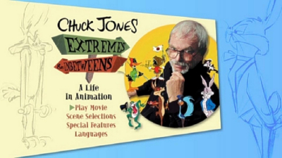
Chuck Jones - Extremes and In-Betweens, a Life in Animation

This biography, shown on American television as part of the PBS "Great Performances" series, examines the life works of one of Hollywood's most celebrated animators, Chuck (Charles M.) Jones. He is best known for Warner Brothers cartoons featuring Bugs Bunny, Daffy Duck, Elmer Fudd, Porky Pig, Road Runner, Wile E. Coyote, and Pepe LePew. Included are plenty of behind-the-scenes descriptions of how an animated film is made, and (best of all) many clips from Chuck's cartoons.

Celebrity appearances by WHOOPI GOLDBERG, MATT GROENIG, RON HOWARD, JOHN LASSETER, LEONARD MALTIN, STEVEN SPIELBERG, ROBIN WILLIAMS and more!

 If you fell in love with Chuck Jones  you can have a DVD of Chuck from amazon

Storyboard:

A testament to the life, work and vigor of legendary cartoon director Chuck Jones’, from animation’s pioneering days to some of the last footage of Jones’ before his passing. He offers up his insights into the characters he helped make famous, and there are contributions and tributes from an all-star line up of colleagues, competitors and fans who have found inspiration in Chuck’s early Warner Brothers shorts. As a bonus we even get two cartoons looking as pristine as they come!

chuck01.JPG

The Sweatbox Review:

“The two most important people in animation are Winsor McCay and Walt Disney”, once said Chuck Jones. I’ll spare his modesty and add him to that list (he was also one of these three that were recently the first inductees into the Animation Hall Of Fame), as if there is one other person who made as much impact on animation as those two other fine fellows, then it is Jones, who along with Tex Avery steered animation in a whole new direction. McCay brought life, Disney gave character and music, but Jones and his team at Warners made animated CARTOONS, and even their trade mark steel guitar-accompanied logo is now synonymous with what a cartoon actually is (and referenced as recently as in the Roger Rabbit “Maroon Cartoons”).

chuck06.jpg

The documentary starts with a montage of frantic and zany Chuck moments, during which a top cast of filmmakers, friends and fans pay tribute. Joining the likes of Ron Howard (who directed the live-action version of Jones’ The Grinch) and Robin Williams are Whoopi Goldberg, Joe Dante, Steven Spielberg (who considers One Froggy Evening the “Citizen Kane of animated shorts”), John Lasseter and Simpsons creator Matt Groening.

chuck02.jpg

The film follows Chuck’s life in chronological order, starting with The Early Years, as Jones reveals his first influences, such as McCay’s Gertie The Dinosaur and Chaplin’s comic silent movies. Working his way up from cell washer to animator, Jones worked for directors such as Friz Freleng, Bob Clampett and Tex Avery in the Leon Schlesinger animation building, nicknamed Termite Terrace after their non-animator companions. Here Chuck would develop his own personal style, directing early shorts such as The Draft Horse and The Dover Boys while making his mark on established characters Bugs Bunny, Daffy Duck, Porky Pig and Elmer Fudd.

chuck04.jpg

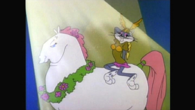
Over the years Chuck would direct some of the best and most fondly remembered Warners cartoons: Super Rabbit (a great pastiche of the Fleischer Superman shorts), Rabbit Fire, Dripalong Daffy, Robin Hood Daffy and the simply brilliant Duck Amuck. Extremes And Inbetweens also pauses occasionally to analyse particular shorts, such as the previously mentioned Duck Amuck, as well as Rocket Squad, The Rabbit of Seville, What’s Opera, Doc? and the Academy Award winning The Dot And The Line.
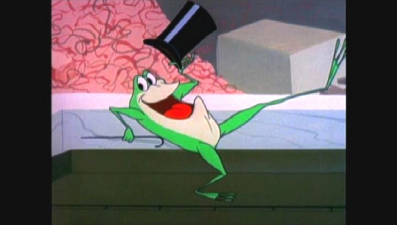
There’s also a look at Jones-created characters Pepe Le Pew, Marvin the Martian, Hubie and Bertie, Michigan J. Frog, the Three Bears and, of course, Wile E Coyote and the Road Runner. The documentary also covers some of the vocal latent behind the drawings (though no real mention of Mel Blanc), the use of music in the WB cartoons, and that classic exaggerated-line WB style. But the story does not end when Jones finally left the Warners lot, following his post-Bugs-and-co. achievements with The Grinch, his rather less successful re-invention of Tom and Jerry, and triumph at the 68th annual Oscars when he won a lifetime achievement award.

chuck05.JPG

Chuck Jones: Extremes And Inbetweens, A Life In Animation is a very rewarding watch, as in depth as some other histories of the Warners Studio (1975’s Bugs Bunny Superstar springs to mind). For over an hour, it’s wonderful to be in the company of a man who learnt his profession from the bottom up, and a man whose intelligent views on human behavior were reflected in his films, from which we in turn can all learn a great deal. Mr Jones, you are sorely missed.

Is This Thing Loaded?

Hop down to the Special Features and there’s even more to enjoy and enlighten. A Chuck Jones Tutorial: Tricks Of The Cartoon Trade is a fantastic follow on to the main program. Featuring extra interviews with the main participants, this is a 14-minute look (presented, as with the feature, in non-anamorphic widescreen) at Jones’ actual cartoon technique, featuring subjects such as Zip Outs, Anticipation, Exaggeration and Anthropomorphism, and comments from new generation artists Glen Keane, Eric Goldberg and Rob Minkoff. It’s a very nice addition, and is entertaining enough for casual film fans as it is for animation artists and buffs, even if it does end rather abruptly.

chuck07.jpg

A couple of pencil tests follow, the first for the classic Ken Harris-animated dance sequence in Mississippi Hare. This short clip has been given an appropriate “projector” audio track that suits the material well. Much more substantial is an almost seven-minute look at a work-in-progress version of the Jones-directed The Grinch. Much of the animation is completed, although some music and dialog is missing. The clip condenses the first half of the story down adequately for the purposes here and when the film does revert to the pencil animation stage it is fascinating stuff! Both of these early animation production clips are presented in their original full-frame ratios.

chuck08.jpg

Chuck Jones Career Highlights isn’t a clip montage retrospective but a few pages of background text, which touch on important moments in Jones’ work. Of better use (but probably too long, which is most certainly why it is not included here) would have been a complete filmography. The Highlights give no dates to any of the events, so unless you are a real fan, this will come across as a once only “oh-that’s-what-he-did” read.

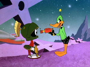
A couple of much better extras are the invaluable inclusions of two classic Charles M Jones shorts from the Warner Bros archives. Feed The Kitty is an often talked about, but pretty routine cartoon, and the historical reason or importance of its addition is not really explained too deeply, apart from the fact that it seems to be very popular with a few celebrity fans. Next up is the absolutely brilliant Duck Dodgers In The 24th ½ Century, Chuck’s take on the space serials popular at the time. Although this is an obvious one to put in with a Chuck Jones retrospective, one can’t but help imagine if this has not actually been included to drum up early buzz on Warners’ up-coming Duck Dodgers television series.

chuck09.jpg

However, both cartoons look amazing, having obviously gone through some kind of extensive restoration. The main program does cover other, more influential, Jones cartoons and it would have been nice to see a few of the real classics (What’s Opera, Doc? The Dot And The Line, High Note and One Froggy Evening for starters), but both Feed The Kitty and Duck Dodgers are most welcome and provide a great teaser – hopefully all the WB shorts will look as good as this on disc when those Looney Tunes collections start filtering through!
No added DVD-ROM material has been included, but for more on Chuck (including the full filmography missing here) visit his website, ChuckJones.com.

Case Study:

Warners’ custom snapcase strikes again, offset by some bright and colorful cover art that emphasizes Chuck’s cartoon creation. The inside foldout lists the index marks throughout the program and a pencil line drawing of a late-era Bugs Bunny.

Ink And Paint:

Rather surprisingly, but most welcome, is the fact that Extremes And Inbetweens is presented in widescreen, preserving the 1.78:1 aspect ratio of the new interview segments. On the other hand, and rather annoyingly, the program has not been encoded to take advantage of anamorphic 16×9 enhancement, but although this does seem odd, it’s rather a moot point, as the presentation is more than adequate, and the image will still look fine if blown up on widescreen displays to fill the screen. Within this letterboxed frame, the 1.33:1 cartoon sequences themselves have been windowboxed and squeezed down in size in order for them to be shown in their original aspect ratios. The makers of the documentary should be commended for this, as it means that everything, from the interviews to classic clips, can be seen as originally intended. The lack of 16×9 encoding is a small criticism, but overall this is a fine looking disc and the cartoons look very clean.

chuck03.JPG

Scratch Tracks:

The packaging states this as a two-track, left-and-right, stereo release, but apart from the applause during the Academy Awards clip, this seemed to be pretty much locked to the mono center channel for most of the show. However, when you’re talking about a basic interview set-up, with cartoon clips (which were originally mono anyway) I found no reason to complain. The dialog comes through crisp and clear, the music in the animated sequences has a nice “roundness” to it, while not losing any depth, and everything is easy to understand. Additional subtitles are provided in French and Spanish.

Final Cut:

If you are at all interested in the techniques or history of animation production I would urge you to pick up Extremes And Inbetweens. Simultaneously portraying a man and his philosophy, as well as a genuine look behind-the-scenes at the processes that come together to produce such classic animation, this is not some PR fluff dressed up as a documentary, but a truly genuine look at a man who brought a great deal to the animation table, changing the way cartoons actually thought, as well as the general filmmaking process while he was at it. Although this does not cover everything (the features Gay Purr-ee and The Phantom Tollbooth are conspicuous absences), as a taster for the cartoons to follow on DVD, this a good starting point, and a wonderful tribute to a wonderful human being.

gbr
Mel Blanc , Ken Burns , Chuck Jones , Margaret Selby  |  NR |  DVD

Only 1 left in stock.


Creating truly three-dimensional shapes in After Effects Tutorial

In this tutorial you will learn about 3D camera tracking on a real motion graphics example, 3D alpha mattes, and most importantly - creating awesome 3D shapes and graphics right inside After Effects with no prior modeling skills

Creating truly three-dimensional shapes in After Effects was always a task with no perfect, fast and convenient solution. With CS6 we now have the option to extrude vector shapes. But there’s a better way to create awesome 3D. About time!

Creating truly 3D shapes in After Effects Tutorial

There are many different ways of creating 3D shapes in After Effects. The first think that comes to mind is simply duplicating layers. That is still a good technique on a fast enough machine, however (as with all semi solutions) it has it’s limitations, out of which no true depth is the most annoying one. Then there’s the old-school trick with the Shatter effect, and my very own CE Shape Extruder, not to mention many different plugins. You can learn about the mentioned techniques in the CE Shape Extruder tutorial. All of them are still valid and good solutions for different situations.


Many 3rd party plugins have been released over the years (like Zaxwerks ProAnimator) to address the need of creating 3D objects in After Effects, one of which is now gaining a lot of popularity, since it also is GPU Accelerated and it allows for importing 3D objects from other applications. I’m talking of course about Element 3D by Video Copilot. Even though all these plugins are fantastic, they too have their limitations.

The plugin I’d like to introduce you to in this tutorial is ShapeShifter by Mettle, and… you’ve guest it… it has it’s limitations as well, however it suits my needs 90% of the time. First of all it also is GPU accelerated, and I found that it runs way better even on lower-end cards than any other solution mentioned in this article. Not only that, but you can model your 3D shapes and even morph between them without any 3D modeling skills. You can just simply use your already existing 2D skills to create beautiful 3D graphics right inside of After Effects.

As you know from this tutorials that is a BIG thing for me – being able to stay in one application as long as possible. That way if I need to make a change I don’t have to re-open, re-edit, re-save, re-import and replace my already existing files and layers. Even though it does not allow for importing 3D objects it has one very powerful feature that none of the mentioned solutions can give you – displacement maps, which are the core idea behind ShapeShifter. You may be familiar with this concept from plugins like Trapcode Form, Particular or Mir. Basically they allow you to displace pixels in Z-Space using pixel values from another layer or composition. This means you can use any footage, or easily create your shapes inside After Effects and even animate them to create cool looking 3D graphics with smooth surfaces.


tutorials source : http://maltaannon.com/
Additional scripts available from: http://aescripts.com/
malty: Cuber script: http://aescripts.com/malty-cuber/
Plugin: ShapeShifter from Mettle.com - http://mettle.com/
Footage: thanks to Artbeast - http://artbeats.com/

Tuesday, March 26, 2013

How Facial Modeling and Animation, properly


Stop Staring: Facial Modeling and Animation Done Right, 3rd Edition

I have read this book several times cover to cover in a year's time and it is essential to a modeler/ animator's reference library. It does not matter which edition you read. Each one is not the same and honeslty, I use the second and third edition simultaneously. I do this because in the third edtiion, the author takes a slightly different approach to the examples and takes a less step by step method. In other words if you are an absolute newbie to modeling, make sure you have a good understanding of how to "model" in 3d space, not just front and side views before picking up this book. Otherwise, you might find yourself getting frustrated. There are alot of ways to put a face together, but the piece by piece method in this book produces such clean, efficient geometry, that even if you choose to go another route, the lessons learned here will still prove to be valuable.

It should also be mentioned, that although the author claims not to be an "expert," I found his explanation on texturing to be very helpful and it came very handy for my intro to textures course.

Finally, there may be a few complaints about this book not going into specific detail about the tools in Maya 2011, but the truth is it does not have to; these steps can pretty much be done in any 3d package. The software has nothing to do with what this book is trying to teach modeling wise. Also downloading the zips (they must be extracted afterward) from the website is quick and painless; no CD required.

Book Descrption
If you want to do character facial modeling and animation at the high levels achieved in today’s films and games, Stop Staring: Facial Modeling and Animation Done Right, Third Edition, is for you. While thoroughly covering the basics such as squash and stretch, lip syncs, and much more, this new edition has been thoroughly updated to capture the very newest professional design techniques, as well as changes in software, including using Python to automate tasks.


  • Shows you how to create facial animation for movies, games, and more
  • Provides in-depth techniques and tips for everyone from students and beginners to high-level professional animators and directors currently in the field
  • Features the author’s valuable insights from his own extensive experience in the field
  • Covers the basics such as squash and stretch, color and shading, and lip syncs, as well as how to automate processes using Python
  • Breathe life into your creations with this important book, considered by many studio 3D artists to be the quintessential reference on facial animation.

    Do you think 2D animation, old-fashioned ?


    Even in the today's era of computer animation, 2D Animation remains one of the fundamentals of animation process. Animated films and television series, to video games and motion graphics are start here, Fundamental of animation

    In this video, Full Sail University 2D Animation Course Director Kathy Blackmore gives a brief overview of the techniques to animate a bouncing ball. Full Sail University's Computer Animation Bachelor's Degree is designed to empower students with the artistic abilities to create 3D computer graphics.

    To learn more, visit Full Sail University Channel on youtube

    Friday, March 15, 2013

    American Web Design Awards 2013

    American Web Design Awards 2013

    THE BEST IN DESIGN FOR WEB, APPS,
    SOCIAL MEDIA, TABLETS, MOBILE + MORE


     DEADLINE: APRIL 5, 2013

    Graphic Design USA is celebrating its 50th anniversary as the news and ideas magazine for creative professionals, and as an organizer of design competitions that spotlight areas of growth and opportunity for the creative community.

    We invite you to enter the 2013 American Web Design Awards. This is our annual showcase of the power of design to enhance websites and online communications.


    Wednesday, March 13, 2013

    The PaperFace: ‘People and Quotes’ Poster Series and Calendar

    The paperface
    is a work of art, made from brown paper cover (the cover of the coffee used to wrap notebooks elementary school children) who are appointed through photography and lighting techniques. Profiles and texture techniques executed through tearing, folding, and pinching paper by hand and through woodcuts graphical techniques (but in this case on paper). The work that has been completed, photographed by adjusting the lighting angle for a face lift texture and silhouette with black cardboard base. Perforation or tear in the paper form the outline is an outline illustration, while pinch-pinch on paper, facial wrinkles forming a contrast with the light angle and paper into a living portrait. Furthermore, the process of paper folding and pelecekan made ​​spontaneously to enrich the texture, while providing expressiveness feel that "home" and not too neat. Each work mengulik detail accuracy and diligence in the impression of spontaneous and expressive imagery. The work and techniques represent the harmonious unity between fundamentals and innovation, simplicity and complexity.  


    Here is how to make it:


    PEOPLE AND QUOTES
    This project invites us to look back at the world leaders in the work, achievements and values ​​contained in quotes - either in science, art, and nationalism. "Rendered through cutting, pinching and carving the humble brown-paper wrapper, these portraits Remind us that greatness comes out of and transcends the ordinary." The selection of each figure represent figures, of every month of birth from January to December.


    Sun Tzu Poster
     Mozart Poster
     Einstein Poster


    Kartini Poster
    Che Poster
    Soekarno Poster
    Rembrandt-Poster
    Hatta Poster
    Cervantes Poster
    Gandhi Poster
    Bruce Lee Poster
    Mao Poster
    Lennon Poster

    Paperface artist, photographer, concept & creative direction, graphic design: Sandy Karman Printing: Indonesia Printer Paper: Paperina source : dgi indonesia

    Monday, March 11, 2013

    Art and Design Degree Show 2013

    Degree Show

    Creativity 2013 Celebrating the talent and innovative work of our final year students. 14 - 20 June 2013

    Art and Design Degree Show celebrates the talent and innovative work of our final year art and design students. The exhibition showcases exciting creations by the next generation of artists and designers across our art and design courses and attracts over 4000 visitors including potential employers.

    Opening times 2013

    Friday 14 June 5.30pm - 8.30pm
    Saturday 15 June 11am - 4pm
    Monday 17 June -
    Wednesday 19 June 10am - 5pm
    Thursday 20 June 10am - 8.30pm

    Location: De Montfort University, Fletcher Building.
    For directions please visit our How to find us page.
    No booking required.
    If you would like to find out more about our events, join our mailing list.

    For further information contact:
    E: degreeshow@dmu.ac.uk
    T: (0116) 207 8527


    Exhibiting courses 2013
    Animation Design BA (Hons)Architecture BA (Hons)
    Architecture MArchArchitectural Design Technology and Production BSc (Hons)
    Contour Fashion BA (Hons)Design Crafts BA (Hons)
    Design Products MDesFashion Buying BA (Hons)
    Fashion Design BA (Hons)Fashion Fabrics and Accessories BA (Hons)
    Fashion Technology BSc (Hons)Fine Art BA (Hons)
    Footwear Design BA (Hons)Furniture Design BA (Hons)
    Game Art Design BA (Hons)Graphic Design BA (Hons)
    Graphic Design and Illustration BA (Hons)Interior Design BA (Hons)
    Photography and Video BA (Hons)Product Design BA (Hons)
    Product Design BSc (Hons)Product and Furniture Design BA (Hons)
    Textile Design BA (Hons)


    Design Art Gallery :
     

    The best Art Schools in the United States

    Thousands of art school in the United States, some standing in the art world as the best schools based on academic grades. Some special art schools and some colleges of general education department is outstanding.


    Rhode Island School of Design
    enjoys the highest profile in art and design, and the superlative honor among experts in the art world. A student with a degree from RISD booth registration will have their resume 'to move to the top of the pile. It is, however, not without a huge investment. The average cost of more than 100,000.00 per year, just a great artist very serious need apply. Which, in fact, probably most of the award given to graduates of this school.

    Yale University,
    is one of the most respected centers of education in America, also enjoys the status of having one of the best art schools in the United States for graduate work. Yale offers courses for several areas of visual arts and engineering, as well as the history of art - the foundation of the company for more intense graduate work.

    Art Institute of Chicago 
    offers one of the most unique opportunities for education interpolation art and history can be found. AIC is actually located in one of the best American Museum offers an exceptional experience for those who enjoy a saturation in the spirit and discipline.

    Cranbrook Academy of Art, 
    located in Southeast Michigan north of Detroit, has developed a reputation for modernism in architecture, and many other genres in the field.

    Maryland Institute College of Art 
    main focus (no pun intended), is on the visual arts such as graphic design, illustration, animation, and video film. Graduates of Mika apply in Pixar or Disney will be positioned well for serious consideration.

    Virginia Commonwealth University, 
    the state university, offers some 18 undergraduate art department for many modern forms of digital and design. This is a quality education at a more affordable price. But, it does not shine in and go pretty hard, so this is not for the weak students about careers in this field.

    California Institute of the Arts 

    known as the first Academy to offer programs in visual and performing arts. It only makes sense because Hollywood is the capital of the entertainment industry. Programs are offered in art, theater, dance and music.

    Carnegie Melon University College of Art 
    offers a good selection at the school of art, architecture, design, drama and music commensurate with CMU's overall reputation.

    University of California Los Angeles (UCLA)
    may offer a variety of the most interesting in the majors in the school of art and architecture. Majoring in art and culture, ethnomusicology and a clear urban design for out-of-the-box thinker looking for a very special career.

    Art Center College of Design
    ,
    a private college located in Pasadena, CA, originally built his reputation as a vocational school. It still retains a real-world focus on skill, technique and professionalism. If the practical skills and abilities of your goals, the art center for real clients like Nike and Disney have got a position as one of the 11 best design schools in the United States.